Faberge Bell Jar
SOM Time Capsule Competition | 3rd PlaceClient: 360 Chicago + Montparnasse Group 56
Design Team | Tafhim Rahman + Brian Poling
Project Year | 2018
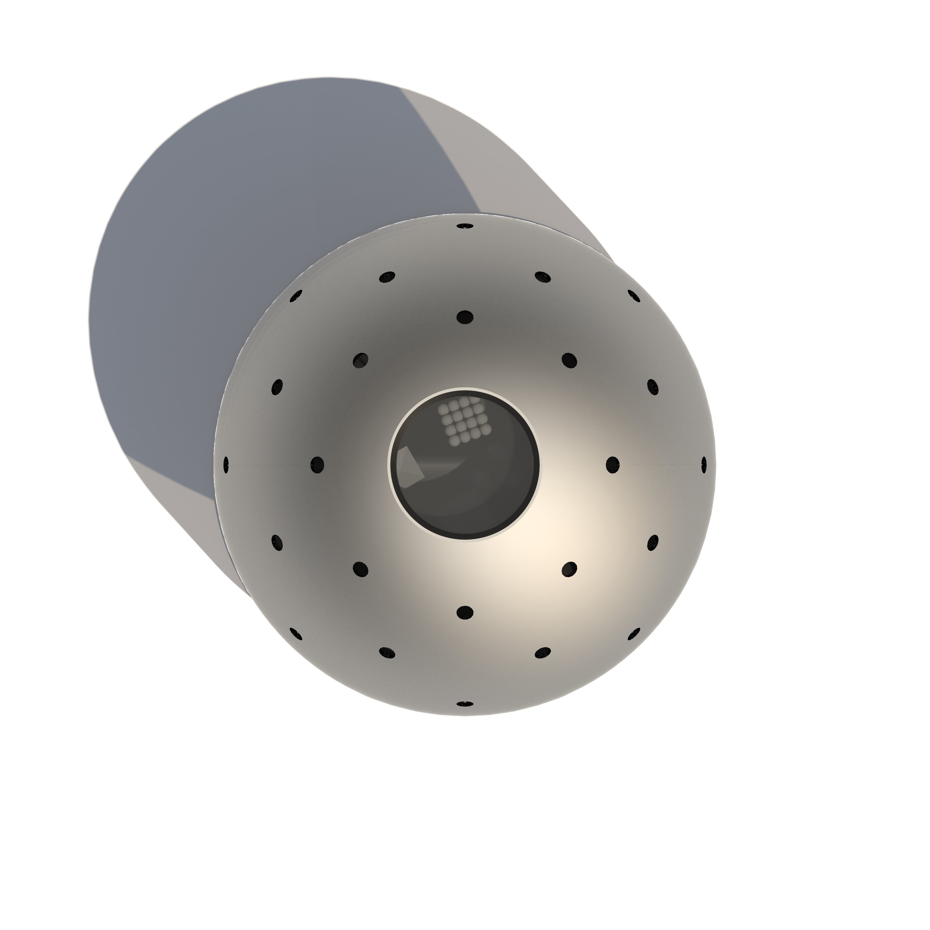


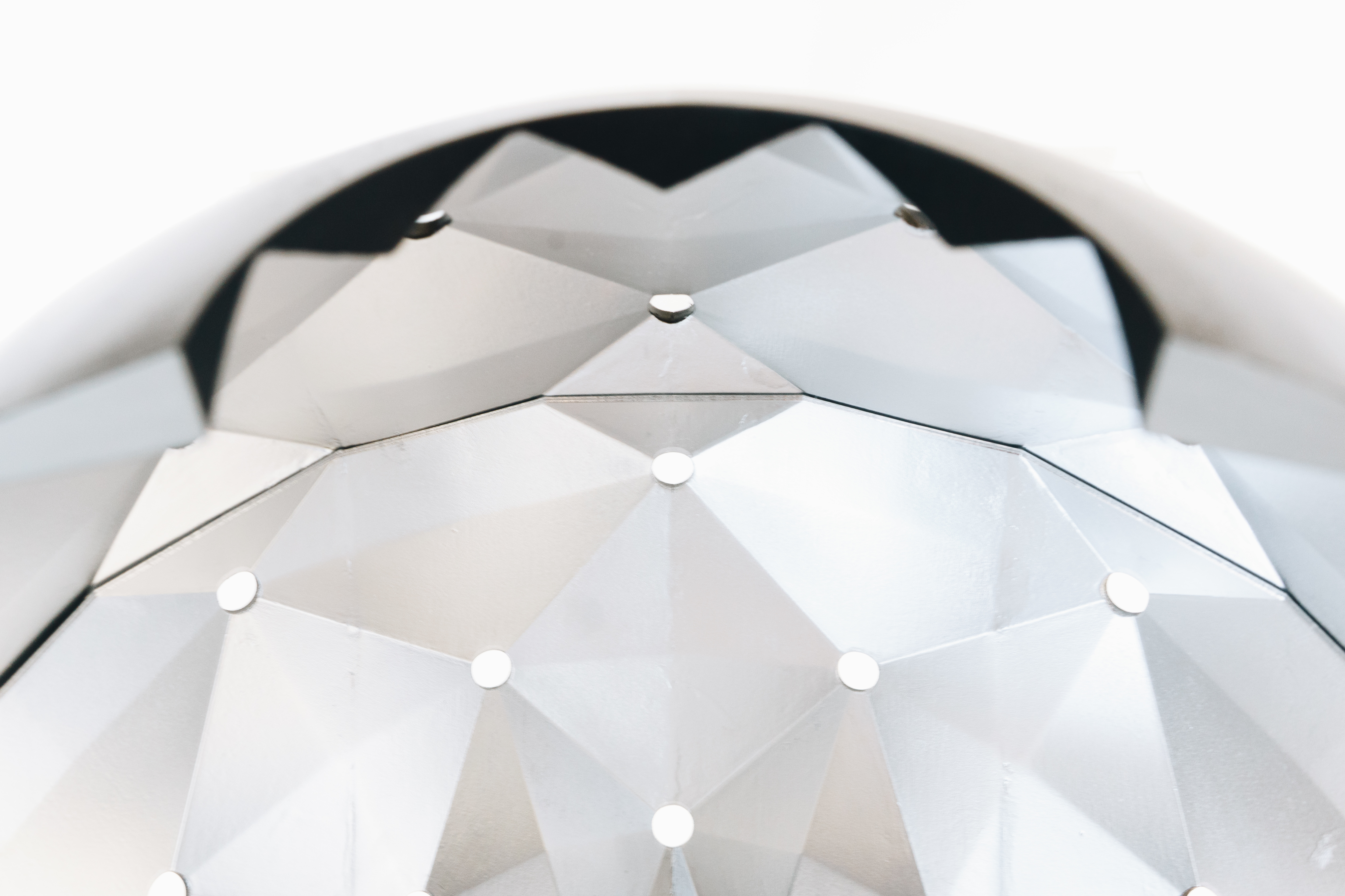

The Fabergé Bell Jar seeks to reconcile the inherent contradictions of a time capsule intended for public view. Traditionally, a time capsule is a utilitarian object which conceals its objects from the public; only a plaque commemorates its location and time of installation. Thus, a public time capsule becomes a fascinatingly complex object which has the potential to both reveal and obscure its contents. Our interest in this contradiction resulted in a study of Fabergé Eggs and Bell Jars for inspiration. While serving similar utilitarian purposes, these items could not be more different from one another. The former showcases itself as an object that attracts attention but obscures its contents. The latter readily displays its contents without drawing much attention to itself as a storage vessel. To achieve a synthesis of these two opposing objectives, we chose to emulate the simple form of the Bell Jar with an opulent interior inspired by Fabergé Eggs. This approach also takes cues from contemporary buildings with a reflective curtain wall with a set-back structure and turns it inside-out.
In addition to our research of storage vessels, we also studied the John Hancock Tower in search of subtle details and inspiration. We soon discovered that the building itself resolves some of the seeming contradictions we hope to resolve. Three of these findings we explored in depth are its ability to seem both sturdy and delicate; the subtle architectural qualities that achieve an expressed clarity of its structure, and a thriving public plaza that finds success next to one of the tallest buildings in Chicago. Its truncated pyramidal shape is reminiscent of the sturdy, everlasting ancient pyramids and ziggurats, yet it achieves a visually stable shape through the delicate tubed structural truss system. Although the structure is delicate, when standing at the ground level, the building feels quite anchored due to how the truss terminates at the stone-clad ground floor. This anchoring itself is a trick played on the viewer since that would require massive pylons at the four corners of the building. So, while the truss visually terminates at the ground floor, the actual structure resolves itself via small one-story “X” members in the basement.
The final contradiction that we found interesting is between the monolithic nature of the building and its surprisingly successful public plaza. The tower itself, clad in black painted structure with dark tinted glass -- could easily have a looming presence over the public plaza, but the taper of the tower forces a perspective that makes the already tall building soar without dominating. This is further aided by the material change to a lighter stone cladding which draws the eyes to the single-story ground floor rather than the enormous tower. This, combined with the set-back and the submerged plaza to the food amenities leads to a surprisingly pleasant tower plaza that is rare even in high-rises much smaller than the Hancock. Based on our findings in this study of the Hancock, we concluded that our design should be stable yet delicate; clear yet subtle; and finally, secretive yet accessible.
All works © TKTN 2021.